 Technical fields have a language all their own and a commercial printer is no different. While Classic Impressions is always happy to explain these different terms to our clients. Some basic knowledge of the terms and processes is never a bad thing. The more you know ahead of time, the easier your project planning will be.
Envelopes: Consider the Whole Package
The dimensions of your piece and the envelope you decide to use will dictate a surprising amount of design choices. The envelope influences how the recipient interacts with the piece: It will determine how pieces need to be folded to fit, and therefore how the design needs to be laid out – all of which affects how the prospect will read and interact with your piece.
There are several elements to consider, including:
- Are you using an envelope strictly as an address vehicle, or would you like to add some more. Design elements make your offer stand out.
- Based on your message and the current layout, does a window or non-window envelope make more sense?
- Does the size and folds allow for machine inserting or will they be inserted by hand?
- Should I use an envelope or send it on its own (like a postcard)?
Digital, or Offset?
Chances are, you may have already heard of these terms. Similar results are possible with either (or a combination) of these processes. But each production method has its unique advantages. Do you know what they are?
Offset Printing:
Offset printing traditionally uses plates that transfer an image onto a rubber blanket, that transfers the image to the paper. The advantages of offset printing are better image quality, precise colour matching, branding (with Pantone Colours), and lower cost. The latter being the most common reason Offset is chosen over Digital.
If you are producing a job with larger quantities (into the thousands), the cost savings per piece can be significant. Anything with static elements produced in large volumes will typically be printed offset. Large volume, full color pieces that utilize variable printing (text that changes, names etc.) will have the background printed offset. The names and variable text are added later on using a digital printer to save on cost.
Digital Printing:
Unlike Offset, Digital printing uses toner instead of ink. The technology behind Digital Printing is the fastest moving, and elements such as white toner, fluorescent toner and even embellishment (think foil and varnish) are now options for the Digital Press. It’s streamlined setup and output, along with a variety of bindery options, allows Digital printing to be a fast and effective option.
A huge benefit of Digital over Offset, is it’s ability to print variable text and images – an option which Offset Printing does not allow for. As the Marketplace floods with shorter runs of highly customized pieces, Digital Printers are able to keep up with (and ahead of) the demand. Another great benefit: Digital machines can produce 10 copies of the same layout or 10 different layouts at essentially the same cost. No hefty setup cost or lengthy turn around times here!
Paper
There is SO much more to Paper than meets the eye. There are lots of terms, lots of different types, textures, colours and sizes. This is one aspect where you should definitely lean on the experience of your print shop to recommend something that will meet your needs.
Very broadly, paper has two qualities that you should be aware of: the thickness and the coating:
Thickness
Traditionally there are two main categories that define stock thickness: Cover stock and Text stock. Cover stock is the thicker option – for example, the paper that is used on soft-covered books, postcards and business cards. Text stock is lighter (also referred to as ‘Writing’, ‘Bond’, or ‘Offset’) the same type of paper you put in your home printer (letterhead, flyers and bills).
Within each of these types are a variety of thicknesses (also referred to as ‘Caliper’ or ‘Pts’), but as basics go, knowing the difference between text and cover will help you request the proper stock to your Printer. At Classic, we offer stock sample books that let you touch and feel the different papers for yourself before deciding on a stock thickness. Let us know if you’d like to see some samples!
Coating
A coating is a finish applied to paper, but not all paper is coated! Uncoated paper is often referred to as ‘Opaque’ and ‘Smooth’. Coated Paper finishes include: matte, dull, velvet, satin, silk and glossy. Depending on the look you want for your piece, and the printing method you select (Offset vs. Digital), it is important to understand why and when to choose a certain finish. For example: a bright and vibrant image will appear muted and dull if printed Offset on an uncoated stock, but a glossy finish will make those colors pop. When printing Digital on an uncoated stock, any heavy coverage or large image will appear coated, due to the finish of the toner.
Colour
Colour is one of the more technical elements of commercial printing, and can be confusing. learning how to use color in a print setting is important. Many designers default to RBG, which is also how we view things on our computer screen. For printing, the most common designs (and ALL photographs) use four base colors: Cyan, Magenta, Yellow, and Black (CMYK). However, since this mixing occurs as the printing occurs, it is difficult to exactly match a specific color (a logo, for instance). Digital printing uses CMYK exclusively. When a perfect colour match is required, ALWAYS provide a sample of the colour to your commercial printer.
Offset Colour
If you need to match an exact color, the print shop will use the Pantone Matching System (PMS). PMS mixes inks to match the desired color. This option is exclusive to Offset printing, and provides precise and consistent colors. However, there are CMYK guides available for our Digital presses to find more effective colour matches to existing pantone colours, allowing us to use CMYK to get closer to Pantone than ever before.
For offset printing, you can minimize costs by limiting the number of colors you use (digital printing typically only differs in cost between black and color). For example, An envelope printing a 2 colour logo, is almost half the cost of an envelope printing a CMYK (or ‘Full Colour’) logo.
The shorthand used for discussing colors is written like a fraction, for example “4/0”. Each digit represents the number of unique colors used, with full color CMYK noted as “4”. The divider “/” indicates how many colors are used on the front of the sheet vs the back of the sheet. In our example “4/0” would indicate that the front of the sheet used 4 colors and the back of the sheet is blank (which is what “0” denotes).
This simple shorthand lets your commercial printer understand how many colors you plan to use and where you plan to use them.
Bindery
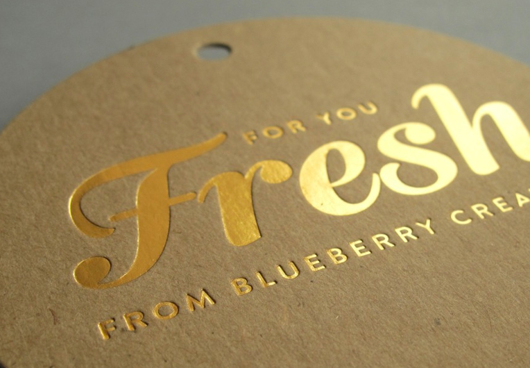
Bindery refers to the final finish of your printed piece. Embossing, foiling, die cutting, folding, scoring, perfing, padding, collating, saddle stitching and coil or perfect binding are the final steps in producing your piece.
Don’t have a live sample? It is always helpful to show your commercial printer other examples (even those you have found online). This will help explain the finished look you are trying to achieve. You can also ask for finished samples of other pieces, similar to yours, so that we can help you create and develop some new ideas.
A Commercial Printer has it all!
We hope you have found this printing 101 guide helpful. Each of these categories could will inspire entire articles all their own. We will explore this in upcoming posts. This simple overview will help you connect the different parts of the print and production cycle of a commercial printer.
If you need help in planning your own print or direct mail campaign reach out to us. One of our Canada Post Smart Mail certified client service representatives will be happy to help.


